
Introduction
AlloCare was designed to help transplant patients better manage their medications, track health metrics, and communicate with care teams. As a customer-facing app, it emphasizes clarity, ease of use, and intuitive data visualization to keep users engaged and informed. The app promotes medication adherence, supports remote monitoring, and fosters a sense of community.
My role
As the lead UX designer for AlloCare, I defined the product structure and screen architecture and collaborated closely with product managers and engineers to translate business requirements into intuitive, user-friendly features. I conducted early user research, mapped user journeys, developed wireframes, and led cross-functional design critiques. During usability testing, I observed how patients interacted with the app and used those insights to refine task flows, simplify data entry, and improve accessibility.
Problem and challenge
One of the biggest challenges was understanding what really matters to transplant patients. It wasn’t just about showing labs or scheduling checkups—it was about helping them feel supported, confident, and in control of their routines.
Solution
The design process started with defining user personas, followed by user research and close collaboration with stakeholders to align on timelines and MVP priorities for phased releases. Throughout the process, we continuously validated ideas with users and incorporated their feedback to ensure the solution met real-world needs.
Personas
I created two primary personas based on research.
James

- Age: 47
- Transplant Timeline: Actively listed for kidney transplant
- Family: Lives with spouse; primary caregiver is his wife
- Education: High school diploma
- Occupation: On medical leave from warehouse job due to end-stage renal disease
- Tech Literacy: Low; only uses a smartphone for basic tasks like calls and texts
- Goals
- Stay compliant with dialysis appointments and lab monitoring
- Track transplant eligibility requirements (labs, screenings, documentation)
- Understand his transplant waitlist status and what affects it
- Reduce stress through clear, timely updates from the transplant center
- Frustrations
- Gets overwhelmed by managing appointments, labs, and medication prep
- Has difficulty understanding complex medical instructions or reading lab results
- Feels out of the loop—wants more transparency on waitlist progress
- Avoids digital tools because past apps felt confusing or impersonal
- About
- James is on the kidney transplant waitlist and managing dialysis, labs, and uncertainty. He’s motivated but struggles with low tech literacy and needs a simple, supportive tool to stay on track and reduce stress.
Sandra

- Age: 32
- Transplant Timeline: Received her transplant 4.5 years ago; in stable health
- Family: Cares for a young child and works full-time
- Education: Bachelor’s in Business
- Occupation: Full-time marketing coordinator
- Tech Literacy: Comfortable using health apps
- Goals
- Regularly tracks lab results to ensure medication effectiveness
- Stay proactive with long-term health tracking
- Maintain balance between health, work, and family
- Frustrations
- Time constraints lead to missed follow-ups
- Feels disconnected from her care team despite using digital tools
- Occasionally misses follow-up visits due to time constraints; feels disconnected from her care team
- About
- Sandra is thriving years after her transplant, but struggles to keep up with appointments and health tracking due to her busy schedule. A streamlined, efficient tool that fits into her mobile lifestyle would help her stay informed and engaged with her care.
Research

To better understand user behavior and user engagement issues, I conducted online interviews via UserZoom with over 20 transplant patients who had used the original version of AlloCare. The goal was to uncover barriers to engagement and identify unmet needs by comparing AlloCare to other health tracking tools. I documented key insights and shared them with stakeholders to guide redesign priorities.
We asked:
- How did you choose this app?
- What made you decide to use it?
- What do you like or dislike about it, and why?
- What feature would you like to see?
- When do you typically check in with your health data, and what prevents you from doing so regularly?
- Has the app helped you stay on track with your medications or lab results? If not, what would help?
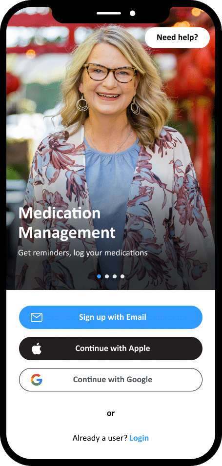
My Concept for the app
As I researched transplant patients’ needs, I found that supporting their daily routines goes far beyond just tracking medications. Many patients take 20 to 30 pills a day, often for life — while also dealing with brain fog, financial stress, and emotional isolation. These challenges can make it difficult to stay on top of their care.
I saw an opportunity to create a product that simplifies the medication input process, but also addresses deeper needs: connection with others through chat, and access to clear, trustworthy transplant knowledge. My goal is to design an app that feels not only functional, but emotionally supportive and human, personalized to meet patients where they are, and designed to reduce the mental load of long-term care.
MVP
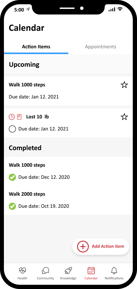
- Stay on track: Fluid intake & biometric tracking made simple.
- Fewer steps: Streamlined med logging & data updates.
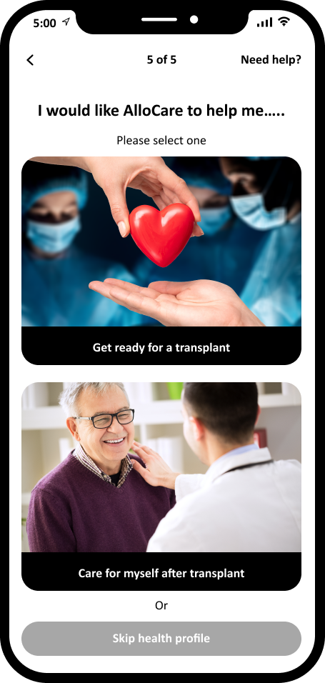
- Personalized: Onboarding adapts to each patient’s journey.
- One-tap actions: Quick notes & reminders from the home screen.
- Confidence: Clear transplant status & lab result view.
- Support: Community hub & learning resources in one place.
- Smart nudges: Notifications that guide, not overwhelm.
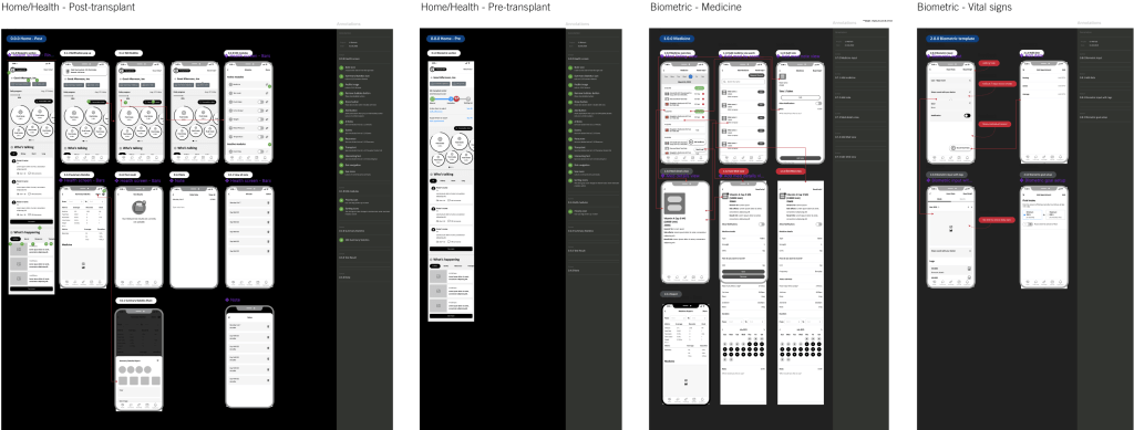
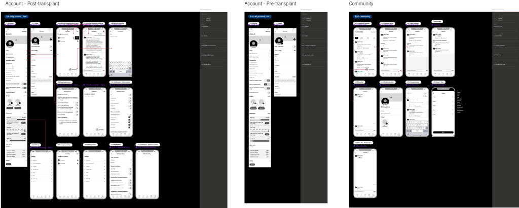
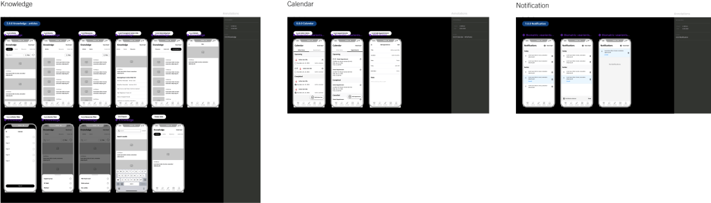
Wireframe design
I developed low-fidelity wireframes to map out the information architecture, validate core functionality, and facilitate early feedback sessions with stakeholders.
Some of the A/B tests
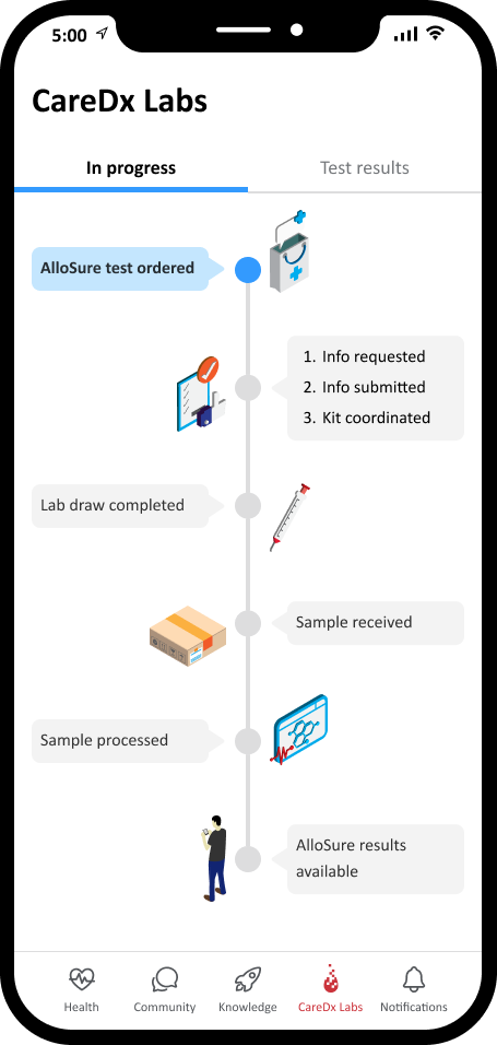
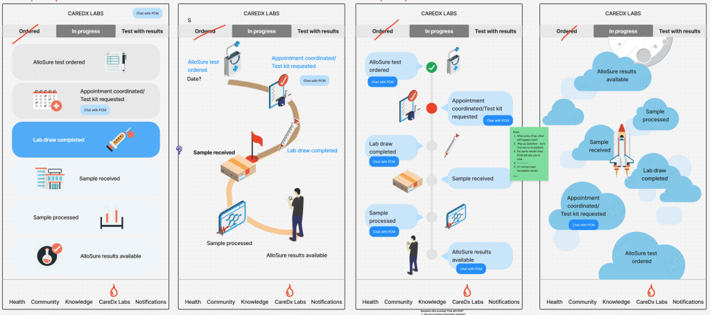
Lab result journey
One hypothesis I had for improving the lab experience was that patients felt uncertain and anxious because they couldn’t clearly see where they were in the lab test process. I believed that making the journey more visual and transparent would help patients feel more in control while waiting for results.
To validate this, I explored four different design variations that showed the journey in unique ways: a card-based layout, a curved path, a progressive timeline, and a gamified rocket-style path. Each design tested how best to balance overview and detail while keeping the user engaged. The version I implemented clearly surfaced each step from test order to results, reducing confusion and making the waiting experience more reassuring.
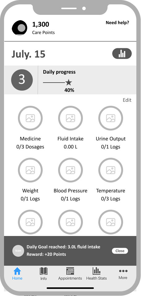
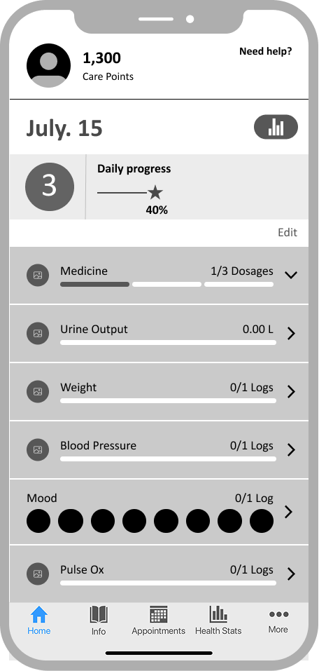
Biometric & Medication Input
Users wanted a more delightful experience to brighten their difficult daily routines, so I created three design variations—an icon grid, a linear list with progress bars, and a bubble visualization—allowing them to choose the layout that best fit their needs.
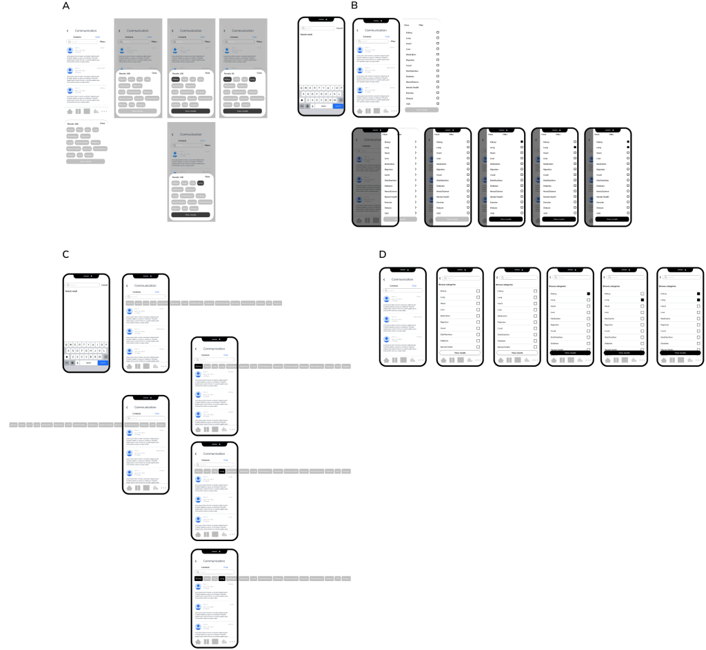
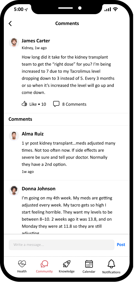
Community filter
One hypothesis I had for improving the community experience was that users struggled to find posts relevant to their specific organ type or medication topic. Without clear filters, the feed could feel overwhelming and less useful. I believed that adding a simple, visible filter would help users quickly narrow down content and increase engagement.
To validate this, I explored four design variations that approached filtering differently. Each design tested how prominently filters should be placed and how easy it was to toggle between categories. The version I implemented surfaced the filters at the top of the feed, allowing users to immediately focus on the topics most important to them, while still maintaining easy access to the full community view.
High-fidelity Design
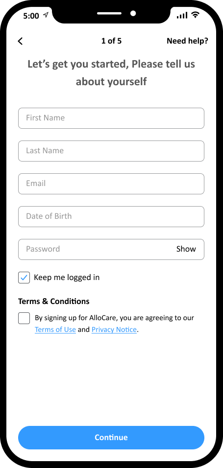
Log in/Registration
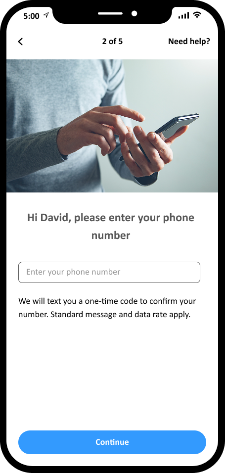
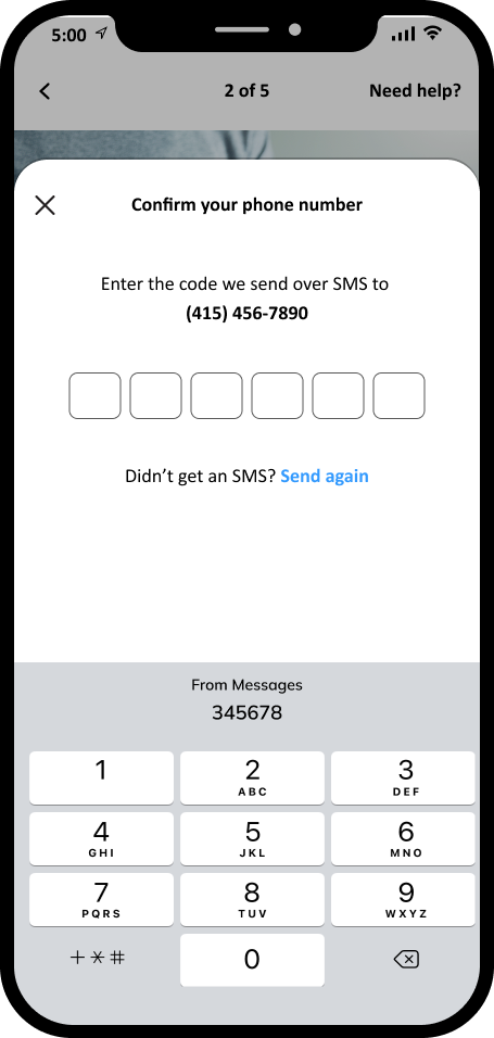
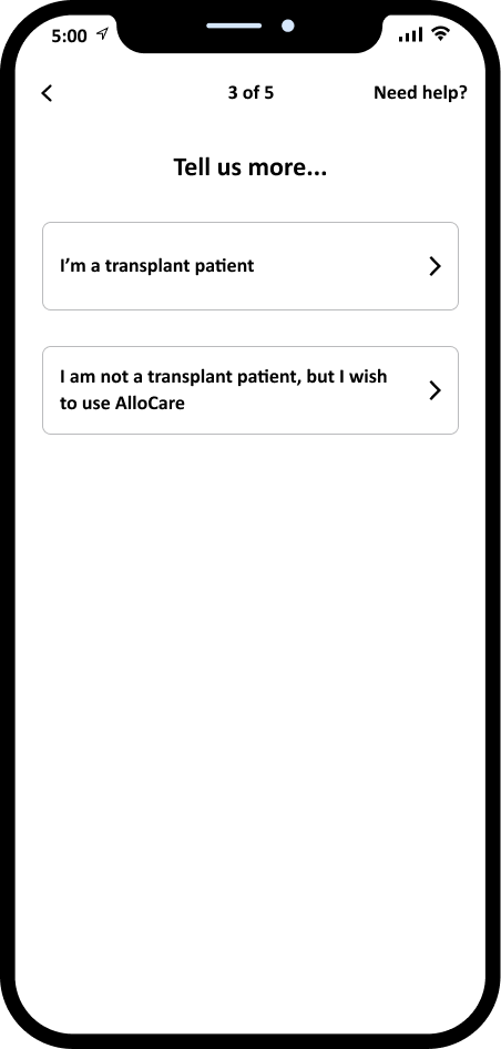
I introduced step-by-step progress indicators throughout the onboarding flow to reduce user uncertainty and support task completion during login and registration.
Pre-transplant screens
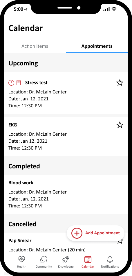
For patients navigating the pre-transplant journey, I designed a timeline view that visualizes key milestones—from referral to evaluation to waitlist. Users can also sync appointments from TxAccess (part of the CareDx ecosystem) directly into their calendar, ensuring better preparation and fewer missed steps.
Post-transplant screens
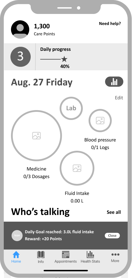
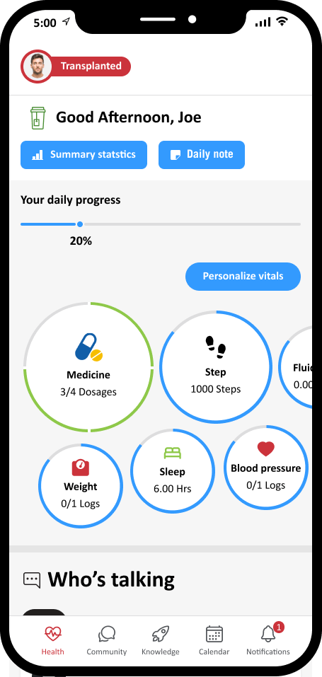
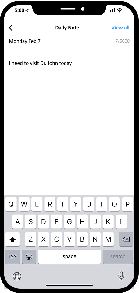
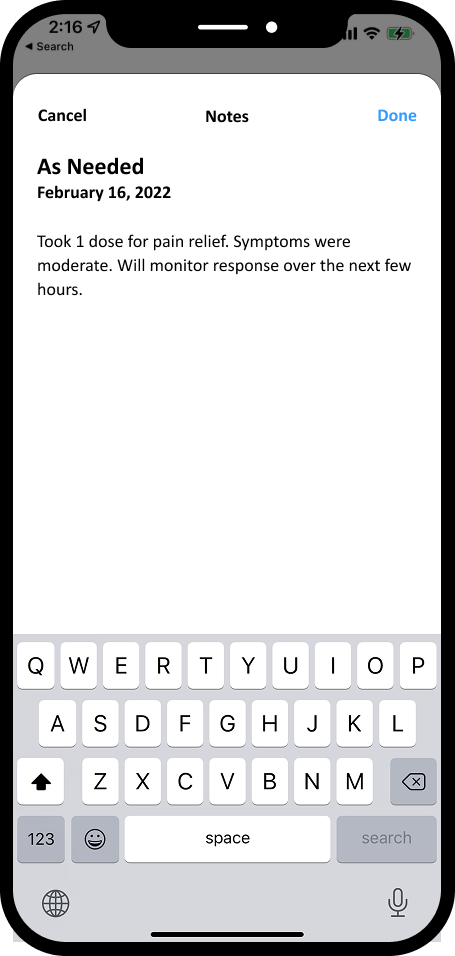
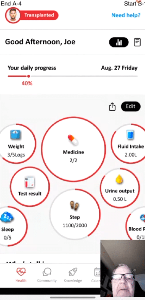
Drawing from user research, I designed a dynamic Bubble Experience that adapts during scroll and supports personalized content modules. Time-sensitive greetings enhance emotional connection, while the home screen’s note feature helps users quickly record insights to share with their care team.
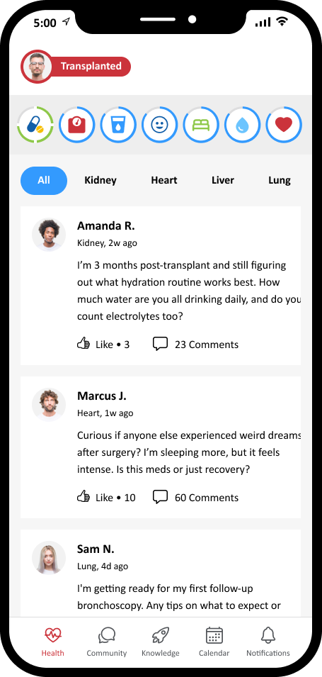
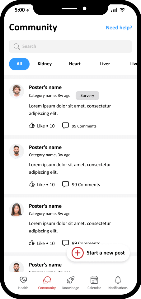
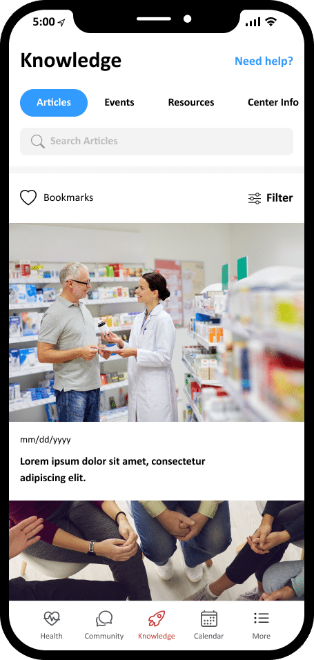
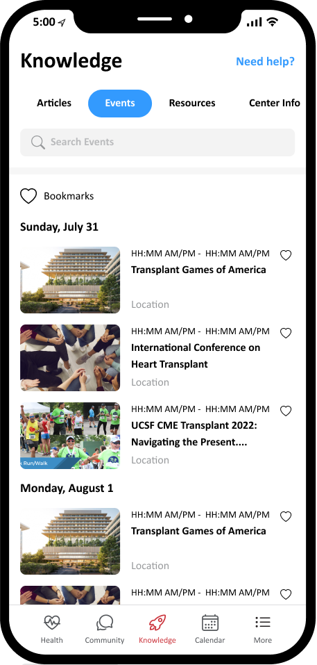
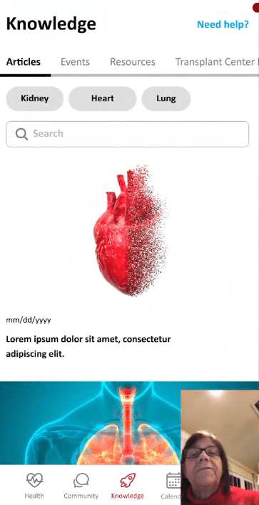
Community/Knowledge
To improve content discoverability, I introduced advanced filtering in both the Community and Knowledge sections. These enhancements, informed by user feedback, help users easily navigate by category and find relevant discussions or educational resources faster.
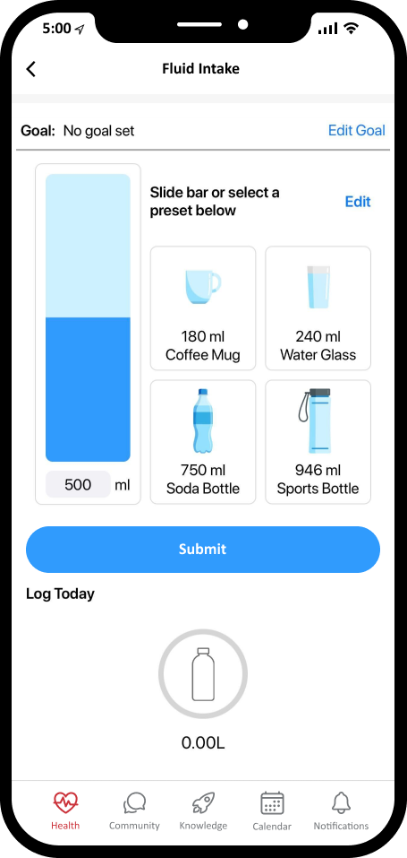
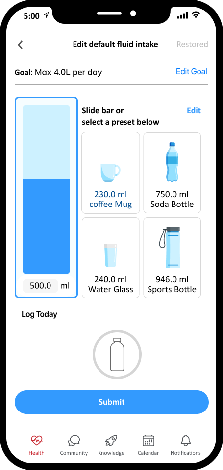
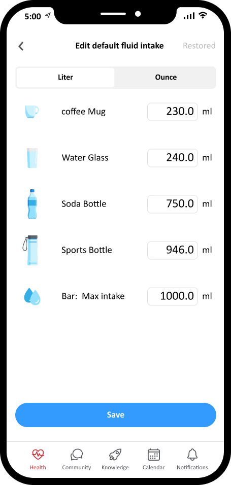
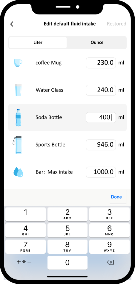
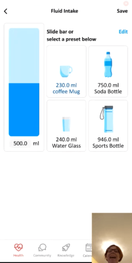
Fluid intake
To streamline hydration tracking, I introduced a fluid intake module with adjustable volume presets and a clean slider interface. User testing validated that the design is intuitive and supports quick, accurate input with minimal friction.
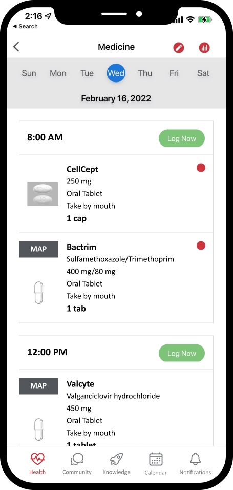
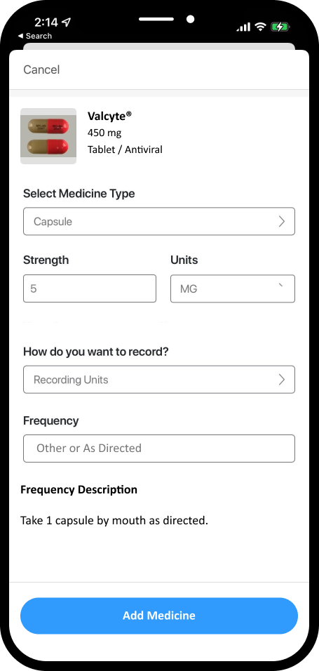
Medicine
To support medication adherence, I redesigned the interface to include large, recognizable medication images alongside clear names, dosages, and instructions. The new layout allows users to easily access detailed guidance—including usage directions, side effects, and purposes—when logging or adding medications.
Usability test
The goal was to test key areas that users interact with most frequently:
- Medication management
- Fluid intake tracking
- Accessing community posts
- Finding educational content
We also wanted to capture participants’ overall impressions of the new interface and identify areas for improvement. Tasks included the following
- You want to find out from other patients what their experience has been with side effects from Tacrolimus. How would you do this in your app?
- It’s time to take your morning medication. Log your medicine now
- Log that you have finished drinking a full bottle of water
- Locating and reading a medication article
- Starting a chat about medication
- Adding a new medication
Some feedback:
- Users appreciated the medication logging feature but suggested that simplifying the interface further could make it even more intuitive and user-friendly.
- A few participants hesitated when using the “Log now” button in medication, highlighting an opportunity to improve onboarding and in-app guidance for first-time users.
- The medication input is more straightforward.
- Finally, I was able to communicate with other patients.
- Watch webinars on the app or browse a list of webinars in the library or knowledge base.
Results
To measure impact, I used Google Analytics to compare user behavior before and after the redesign (July 13, 2023 – July 13, 2024 vs. Jun 17, 2021 – Jun 18, 2022):
- Average engagement time per active user increased by +250.8%, reaching 45 minutes and 25 seconds during the post-redesign period.
- Engaged sessions per active user rose by +561.8%, showing that users were returning more often and engaging more deeply with the app.

Learnings
I applied the latest knowledge from my work at Stryker to revisit and refine key takeaways from the AlloCare project.
What went well
- Conducted multiple rounds of user testing and interviews to deeply understand patient needs and validate design decisions.
- Gained valuable insights into transplant patients’ daily challenges, helping inform key features like fluid tracking and personalized dashboards.
What could be improved
- The design system could have been stronger — setting up proper variables and reusable components earlier would have made iteration and handoff smoother.
- Some UI details could have been more polished. Launching to the App Store was a milestone—but it also reinforced that user testing and iteration shouldn’t stop at launch.