
Intro
I built a scalable iOS design system to unify our product’s look and feel, boost efficiency, and meet strict accessibility standards. Creating it as a Figma library gave the team a single source of truth, so we could design faster without reinventing basic UI elements. The system helped us move from ad hoc patterns to a cohesive set of components and guidelines, saving time and improving quality.
Typography
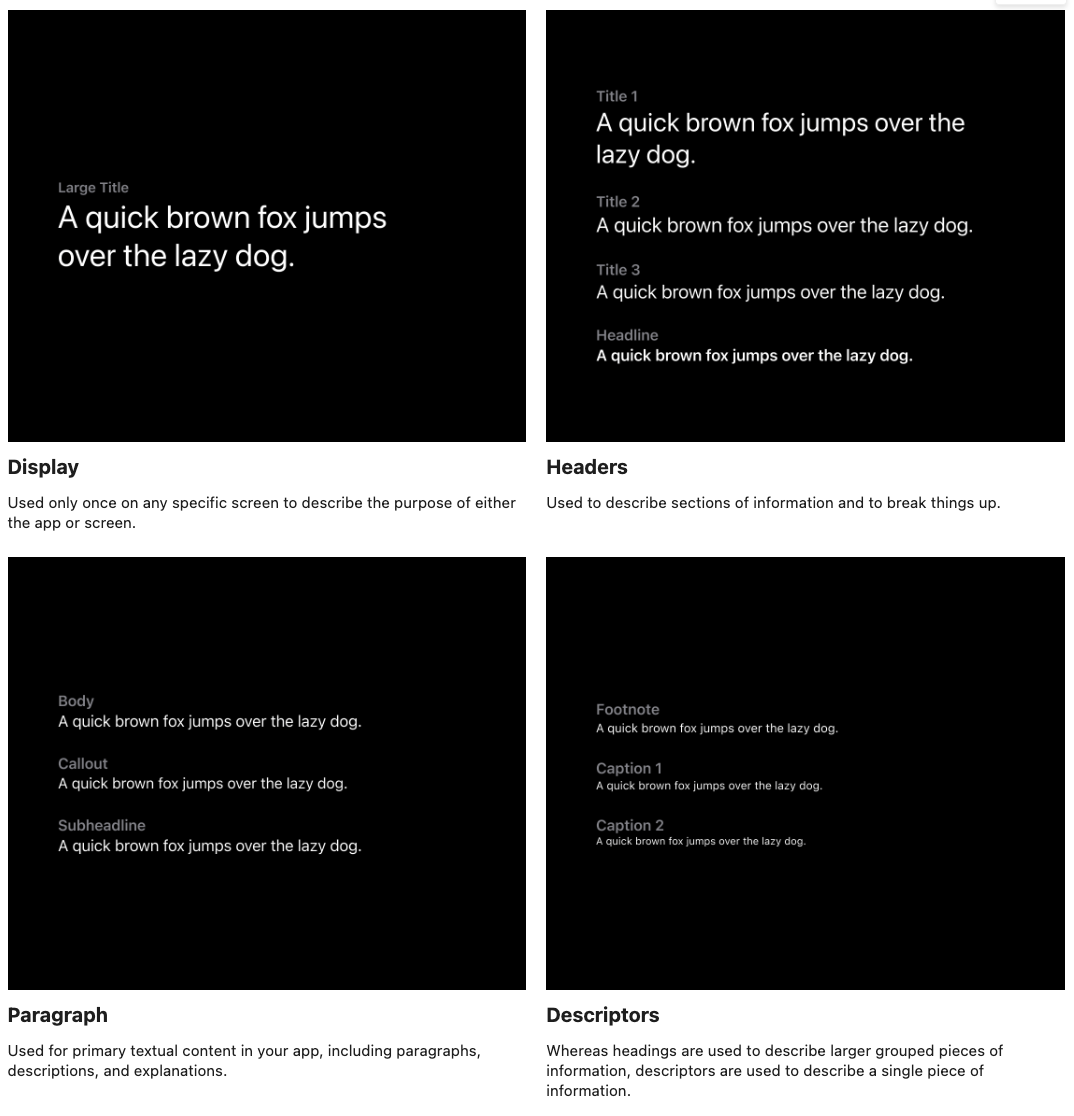
I standardized typography by embracing Apple’s native typeface and a clear type scale. We created a hierarchy of text styles (e.g. headings, body, footnotes) that all team members could follow. To improve accessibility, I implemented Dynamic Type, so text automatically adjusts for users’ preferred font size settings . Each text style was documented with usage guidelines – for example, when to use a heading versus a subheading – ensuring consistency in how typography appears throughout the app. This approach made text more legible and unified, reinforcing both usability and brand voice.
Color System
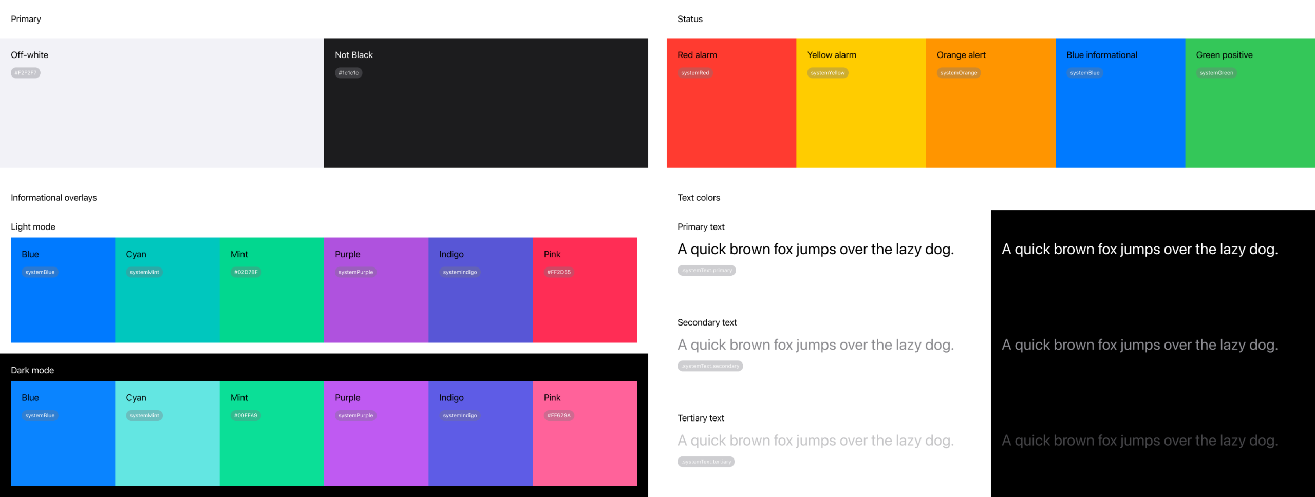
In healthcare design, color serves a functional purpose — not just aesthetic appeal. It plays a vital role in guiding attention, establishing visual hierarchy, and ensuring accessibility. This system is built on a neutral foundation, with purposeful accents used to support clarity and compliance with WCAG 2.1 AA contrast standards.
- Neutral UI (Grays & Whites): Keeps the interface clean, calm, and lets content shine.
- Functional Colors Only: Red = critical, Yellow/Orange = alerts, Green = success, Blue = info. Color is used sparingly to highlight what truly matters.
- Text Hierarchy: Strong contrast for primary text, softer tones for supporting info, muted for disabled states — so users know where to focus.
- Accessible by Design: Colors adapt to dark mode, contrast settings, and colorblind modes through system-level color references.
Design Tokens
To bridge design and development, I introduced design tokens as the single source of truth for all key values. Design tokens are essentially variables that represent core design decisions (like colors, spacing units, and typography scales) . For example, instead of using arbitrary pixel values, we defined spacing tokens (Small = 4px, Medium = 8px, Large = 16px, etc.) and applied these consistently in mocks and code. We did the same for typography (base font sizes, line-heights) and color values. By using named tokens (e.g. PrimaryColor or BaseSpacing) in our designs, any change to a token would propagate throughout the system – keeping the UI in sync and preventing drift between design and development. This token-driven approach made updates much easier and preserved consistency at scale.

Component Library
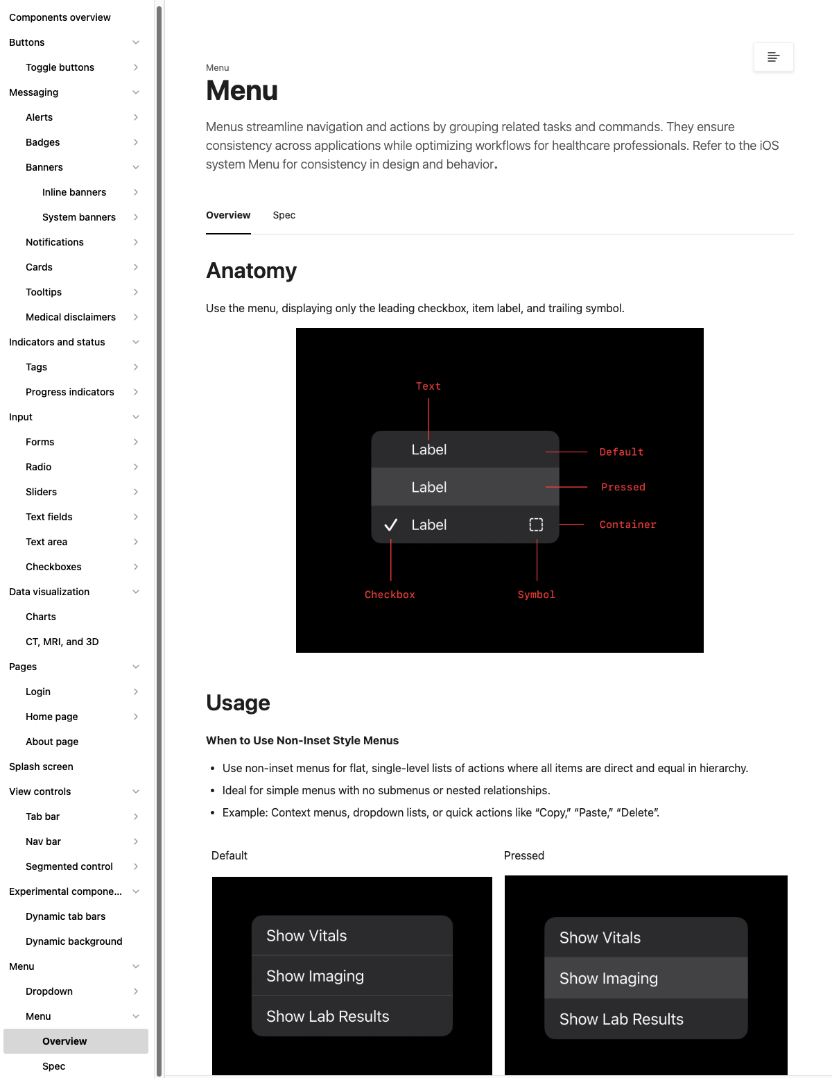
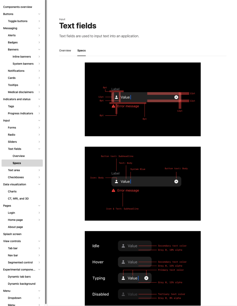
I built an extensive component library to turn our visual language into reusable UI elements. Each component—buttons, forms, navigation bars, and more—comes with variants and component properties so designers can adjust style, shape, color, icons or text without breaking consistency. Figma’s component properties let you modify specific parts of a component (like colors, shapes and layout) in a single location. Instead of editing individual layers, designers can use the right‑hand panel to view, select and customize available property options; boolean, text and instance‑swap properties make it easy to toggle elements, change labels or swap icons across an entire project. This flexibility allows for rapid customization while ensuring every instance conforms to our design rules.
Design System Hub
The Design System Hub is an web platform for sharing design guidelines, components, and best practices. It ensures consistency, efficiency, and collaboration across teams, serving as the single source of truth for a unified user experience.
Regular Maintenance
- The design system is maintained through a transparent, collaborative process .
- We regularly update it to fix defects, improve the product, and meet new standards .
- Changes follow a clear workflow: requests are submitted, reviewed, discussed by the design team, and finally approved and published.
Impact & Learning
This design system dramatically sped up our workflow—designers spend less time on basic UI decisions, developers implement with fewer errors, and users experience a cohesive, accessible product. Building it taught me to balance detailed guidelines with flexibility and to champion the system’s value through its tangible impact on speed, consistency, and quality.