Project overview
Introduction
Franklin Energy’s marketplace is a SaaS platform that connects utility customers with energy-efficient products, rebates, and installation services. It offers curated product selections, educational resources on energy-saving practices, and streamlined contractor scheduling — all in one place.
The goal
Design a user-friendly, customizable marketplace using the latest design system. The platform needed to serve as a Software-as-a-Service (SaaS) solution for utilities, offering a wide range of utilities-focused features while maintaining the client’s unique branding.
Challenge and approach
The biggest challenge was ensuring a seamless transition to each utility client’s style guide.
To solve this, I:
- Linked the final UI to an external style guide for consistent branding.
- Collaborated closely with product, marketing, and engineering teams to meet varied requirements.
- Ran regular design review sessions to address questions quickly and keep alignment across teams.
This approach minimized design drift, supported faster decision-making, and ensured the experience was both on-brand and user-friendly.
SaaS Model
The marketplace-as-a-service model offered flexibility and scalability:
- The system supported both local customization and consistent UX patterns, allowing utilities to adapt without sacrificing usability.
- Utilities could fully customize colors, typography, logos, buttons, and page elements to match their brand.
- Customers enjoyed a cohesive experience across incentives, product listings, and checkout flows.
Wireframe Design
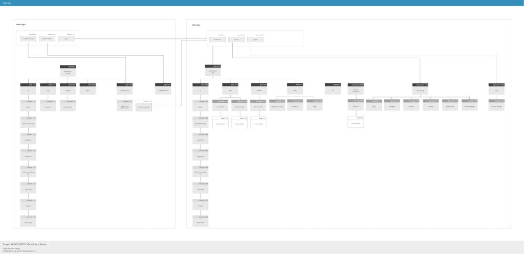
Using wireframes as a shared visual language, I aligned cross-functional teams on structure, hierarchy, and content flow before development began. This early alignment reduced rework, improved decision-making, and ensured the final product was both intuitive for users and feasible for engineers.
I mapped the complete site structure to visualize relationships between content areas and user flows. This blueprint not only streamlined navigation for end users but also gave stakeholders a clear, actionable reference to guide development and content creation.
Visual design
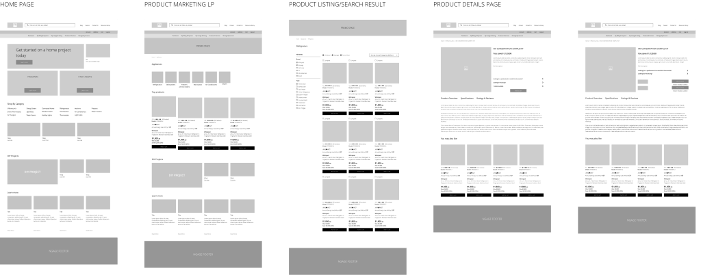
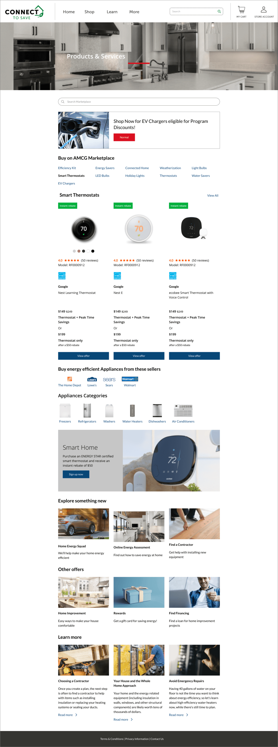
Home page
The visual design prioritizes clarity, trust, and discoverability. From prominent search and category access to clear incentive highlights, each element was crafted to guide users toward energy-saving products while reinforcing the client’s brand.
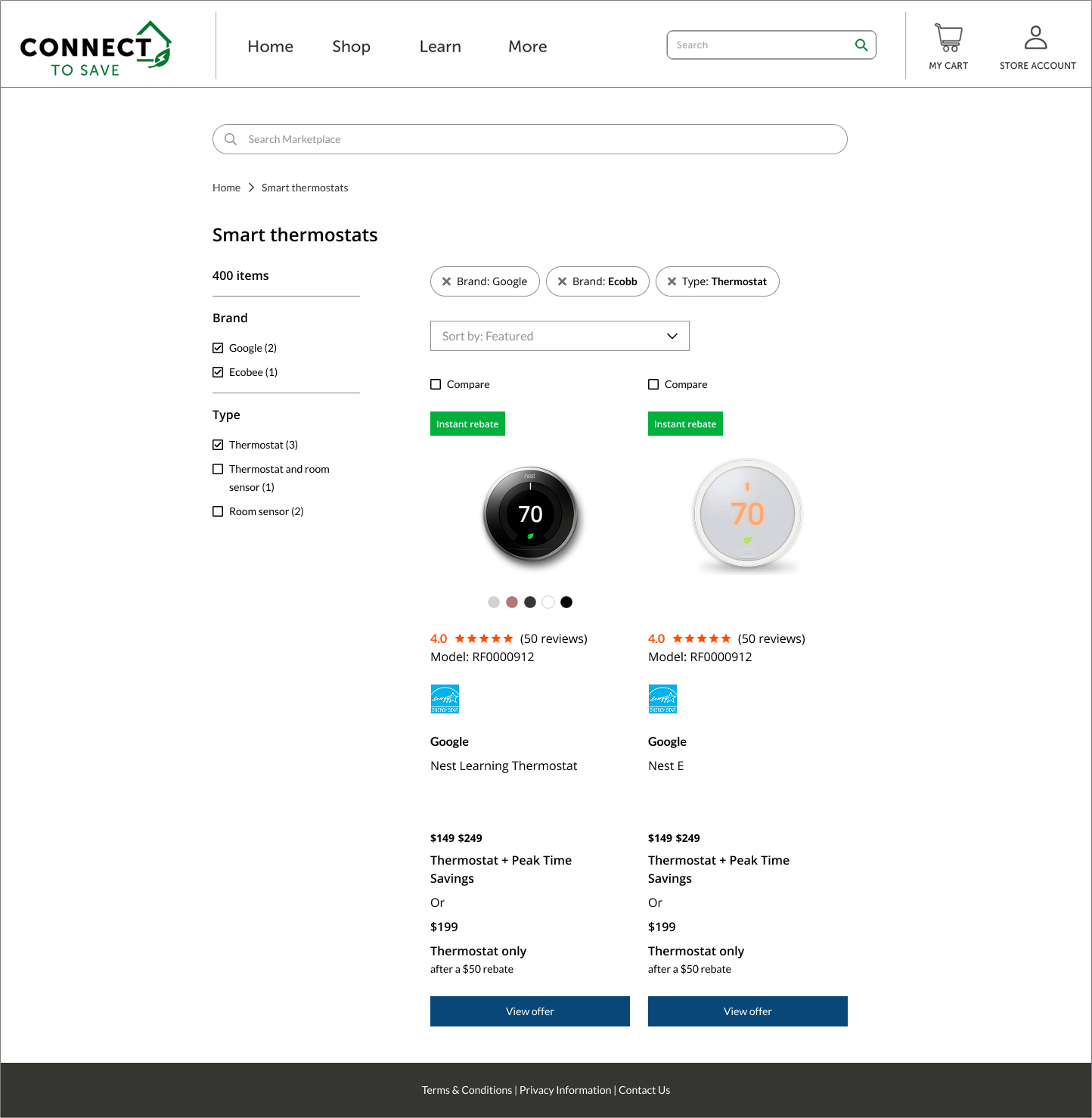
Product landing page
I simplified product discovery by integrating robust filters, side-by-side comparisons, and clear incentives. This design reduces cognitive load, enabling customers to make confident purchase decisions quickly.
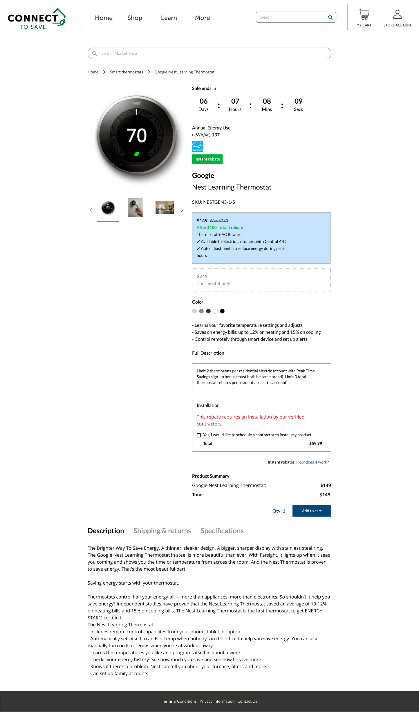
Product details page
I consolidated product specifications, incentives, and installation options into a single view, eliminating the need for users to search for critical information. The result: faster decision-making and higher conversion rates.
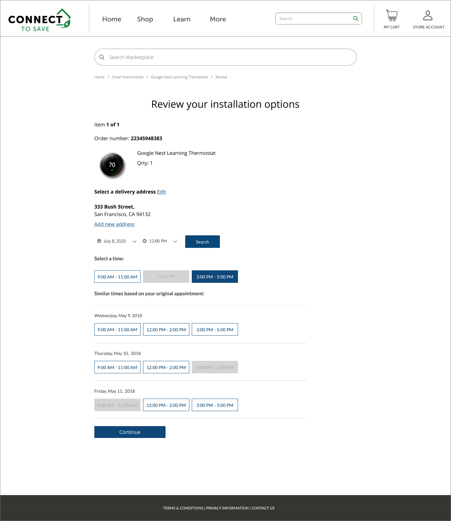
Installation schedule page
I streamlined post-purchase installation by integrating scheduling directly into checkout. Users can select preferred times and coordinate with local contractors in just a few clicks, ensuring the purchase-to-installation flow is seamless.