AlloCare app
HEALTHCARE APP
AlloCare
Introduction
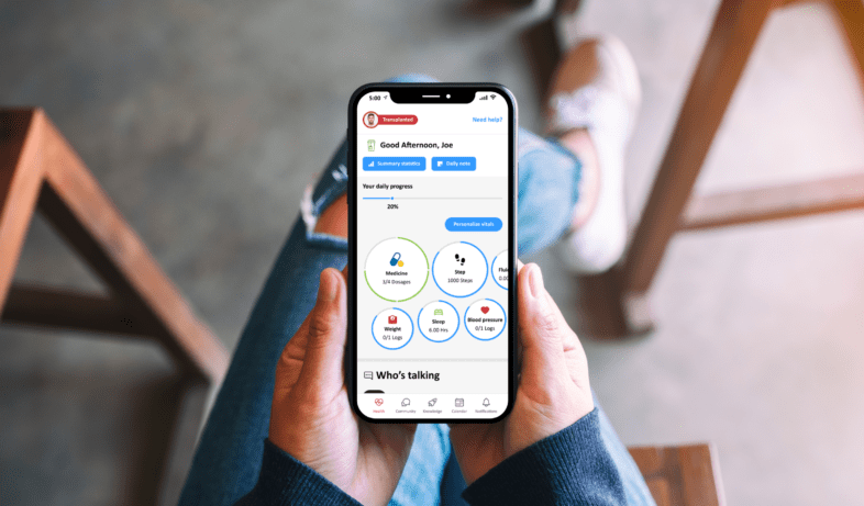
The AlloCare app is a comprehensive health management tool that allows users to log medication, track biometrics, access health articles, socialize, and check testing results. I have been tasked with redesigning the app to enhance user experience and address usability issues. By incorporating user-centric design principles and leveraging advanced technology, the goal is to create an improved AlloCare app that better serves users’ health management needs.
My role
User-Centric Approach
I prioritized understanding end-users’ needs, preferences, and behaviors to create products that addressed their expectations and solved their problems.
Prototyping and Testing
I utilized Principle to build interactive prototypes and conducted usability tests to gather feedback.
Design Thinking
Using design thinking principles, I identified user problems, generated creative ideas, prototyped and iterated solutions, and tested them with real users. This iterative process ensured user-centered designs that were continuously refined based on feedback and data.
Conceptualization and Visualization
I translated abstract ideas, user requirements, and business goals into tangible design concepts using various tools and techniques. Through sketching, wireframing, and creating visual prototypes, I effectively communicated my design ideas and facilitated collaboration with stakeholders.
Design Systems and Guidelines
I contributed to the development and maintenance of design systems and guidelines, ensuring consistency and coherence across products. These frameworks helped maintain a cohesive user experience and streamlined design workflows.
Collaboration and Communication
My role involved working closely with cross-functional teams, such as product managers, engineers, and marketers. Effective communication and collaboration were crucial for aligning everyone’s efforts and ensuring the successful implementation of design solutions.
Problem statement
The issue arises when users of the app discontinue its usage after a few weeks, hindering the intended purpose of supporting a healthy lifestyle and facilitating blood test tracking and scheduling. The lack of direct contact with patients results in a disconnection, leading to a loss of engagement with the app and the company’s services. This situation poses a risk of reduced revenue due to the diminished user base and the missed opportunity for continued interaction and utilization of services.
Business goals
Who is the user?
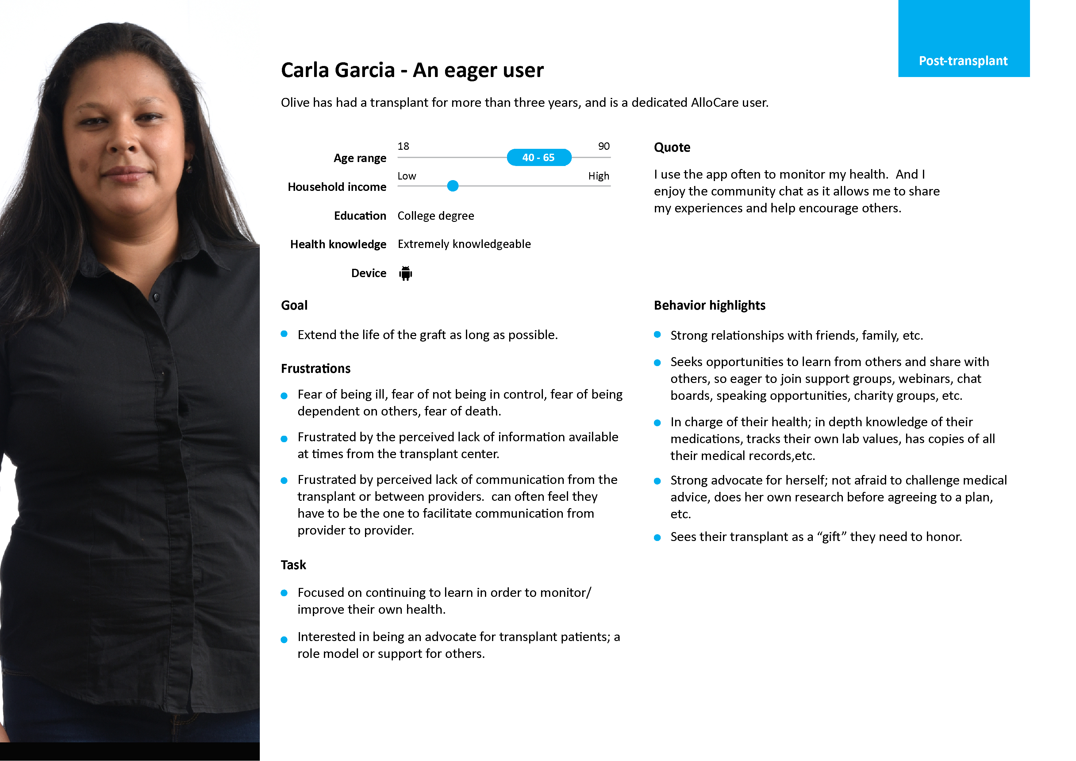
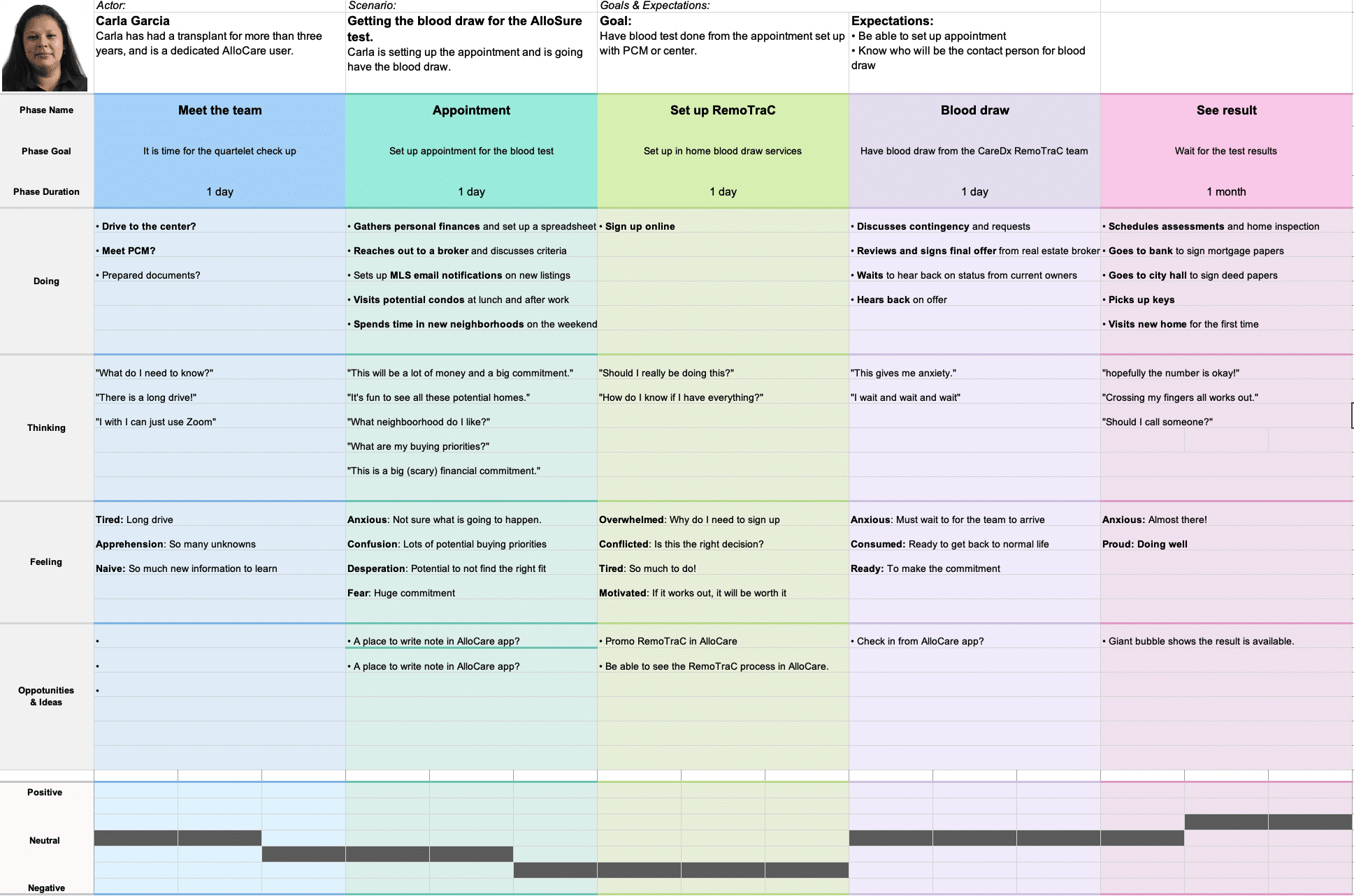
Carla is a five years transplant patient who needs to maintain her daily routine because she wants to keep her organ healthy.
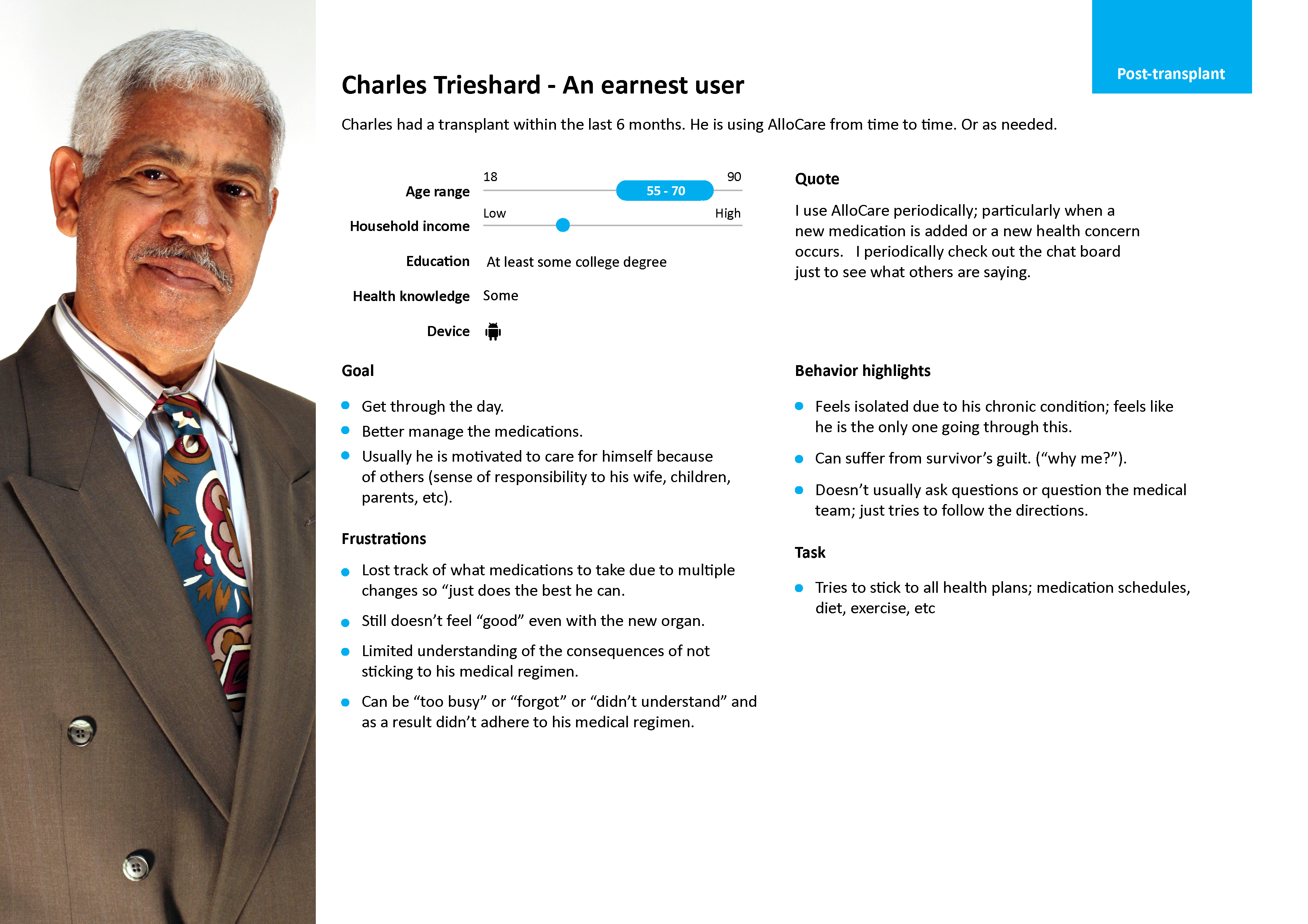
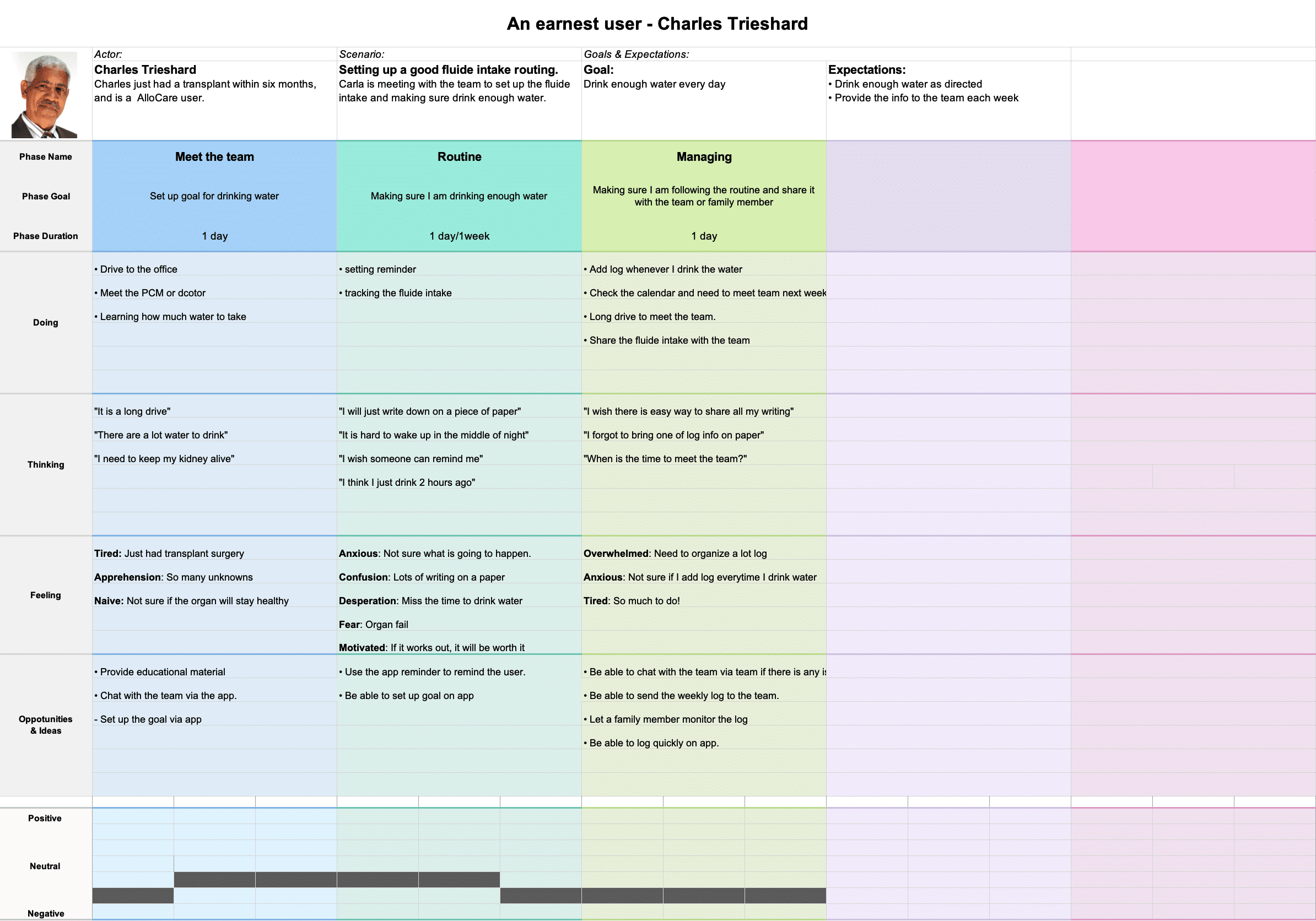
Charles is a 6 month transplant patient who needs to keep up the new routin because he wants to follow doctor’s order properly and on time.
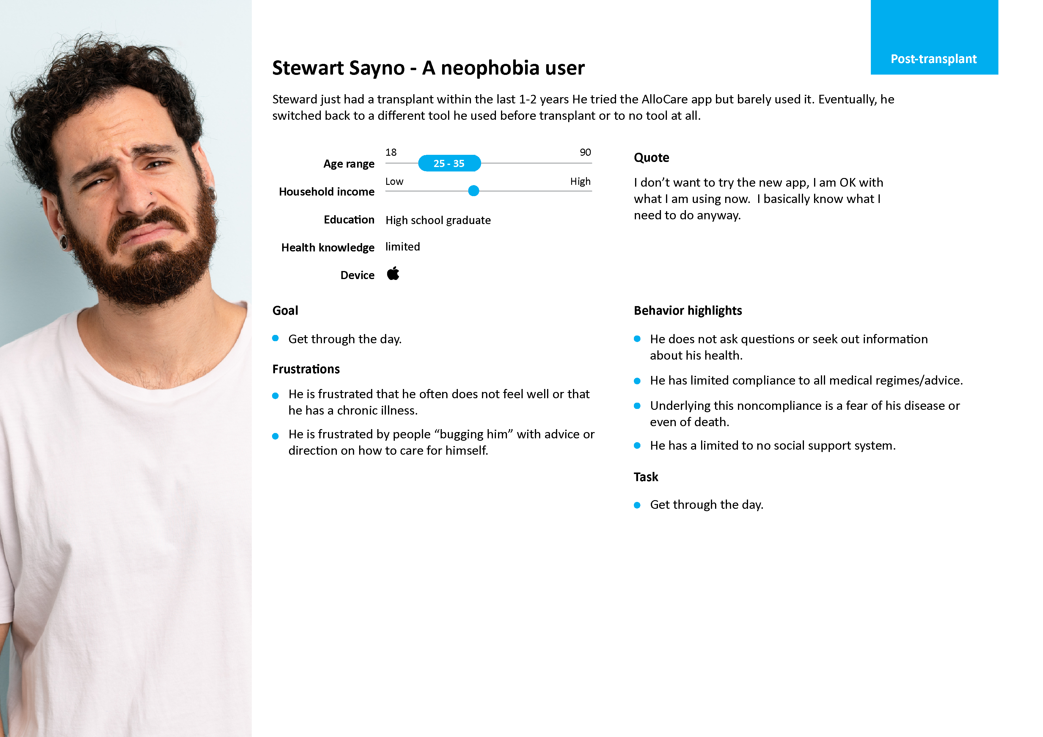
Steward is a transplant patient who requires support and education because he is very afraid of organ failure.
User Research and user pain points
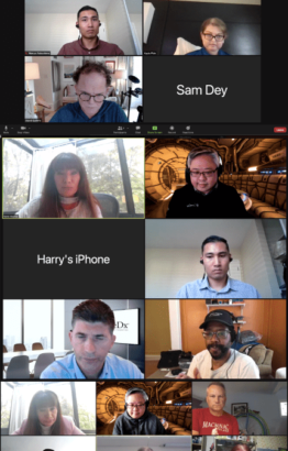
I conducted a moderated interview with 12 users. There are six males and six females. The goal was to find out what users think about the existing app and what other features they want to see in the new design.
Some feedbacks …
“I’d like to be able to easily share the data with the doctor.”
“Add a general note section or to-do list so I can share it with the doctor.”
“Make the app more exciting or fun.”
“I need more support.”
“Can’t enter fluid intake number manually.”
“The med input is too complex.”
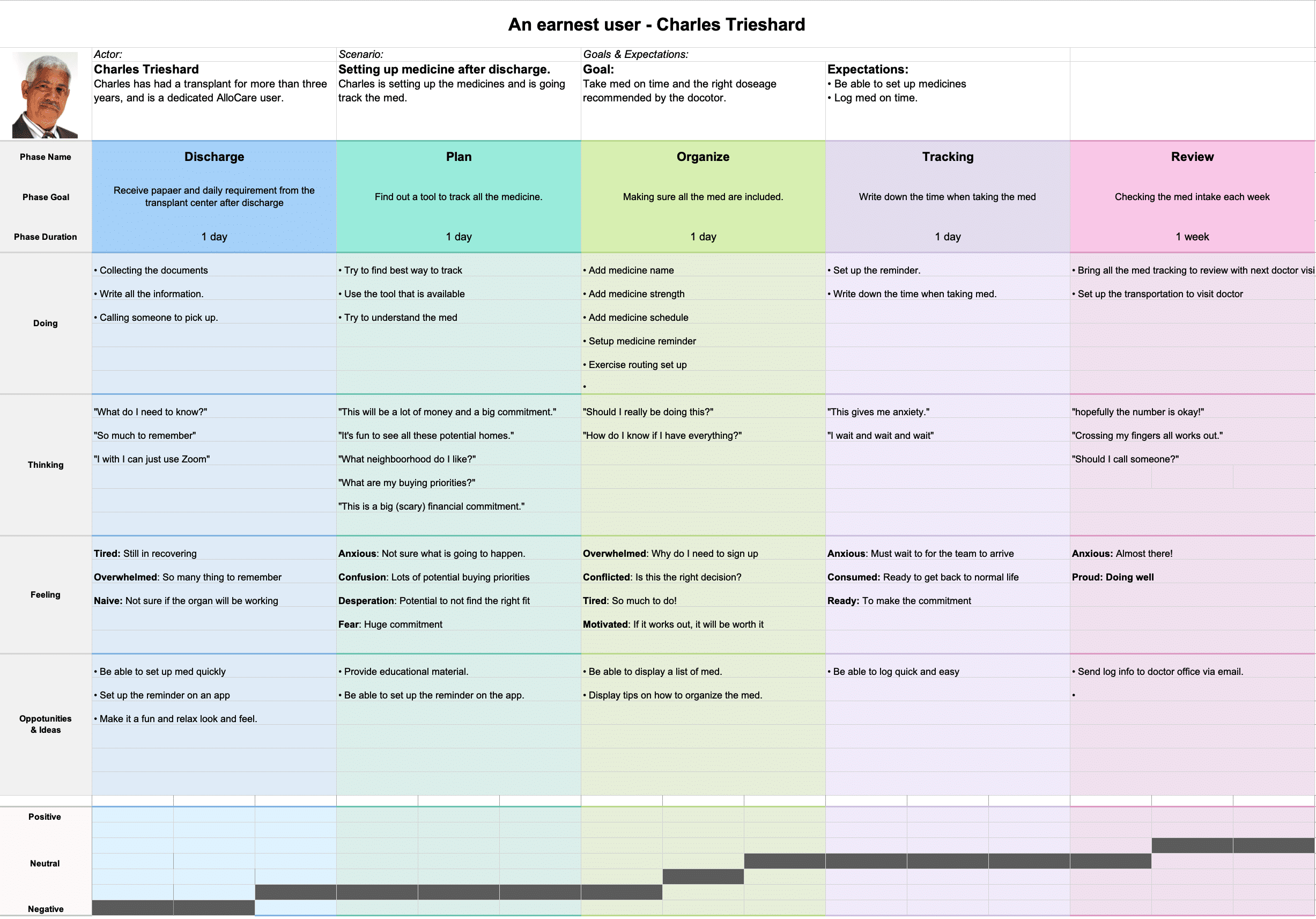
User journey
To streamline the process, I collaborated closely with the product manager and subject expert to prioritize and create the most impactful user journeys that would benefit the business the most.
How do user get blood draw for the AlloSure test?
How do users set up and log their fluid intake?
How do users record their medication?
Gathering The Design Requirements
In productive meetings with key stakeholders, we analyzed user feedback and business needs to identify crucial features that would drive user engagement and retention in the app.
Some of the MUST HAVE requirements….
– RE-design the fluid intake.
– Add note to the home screen.
– Re-design home, medicine, account, and registration.
– Re-design testing services.
– User friendly community and knowledge section.
Wireframe design
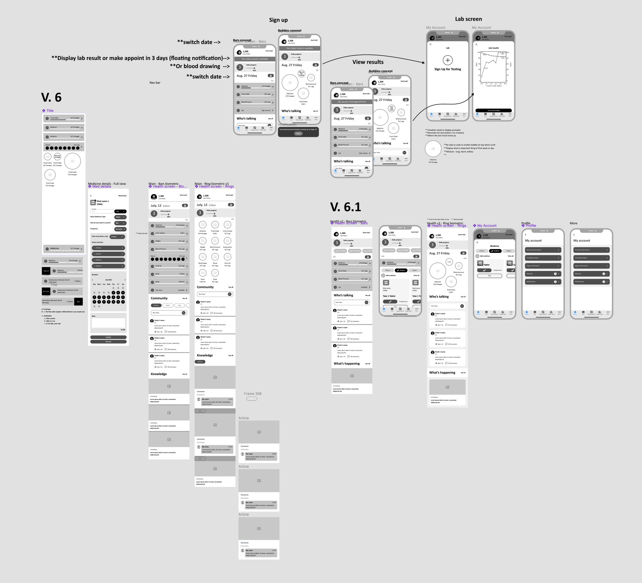
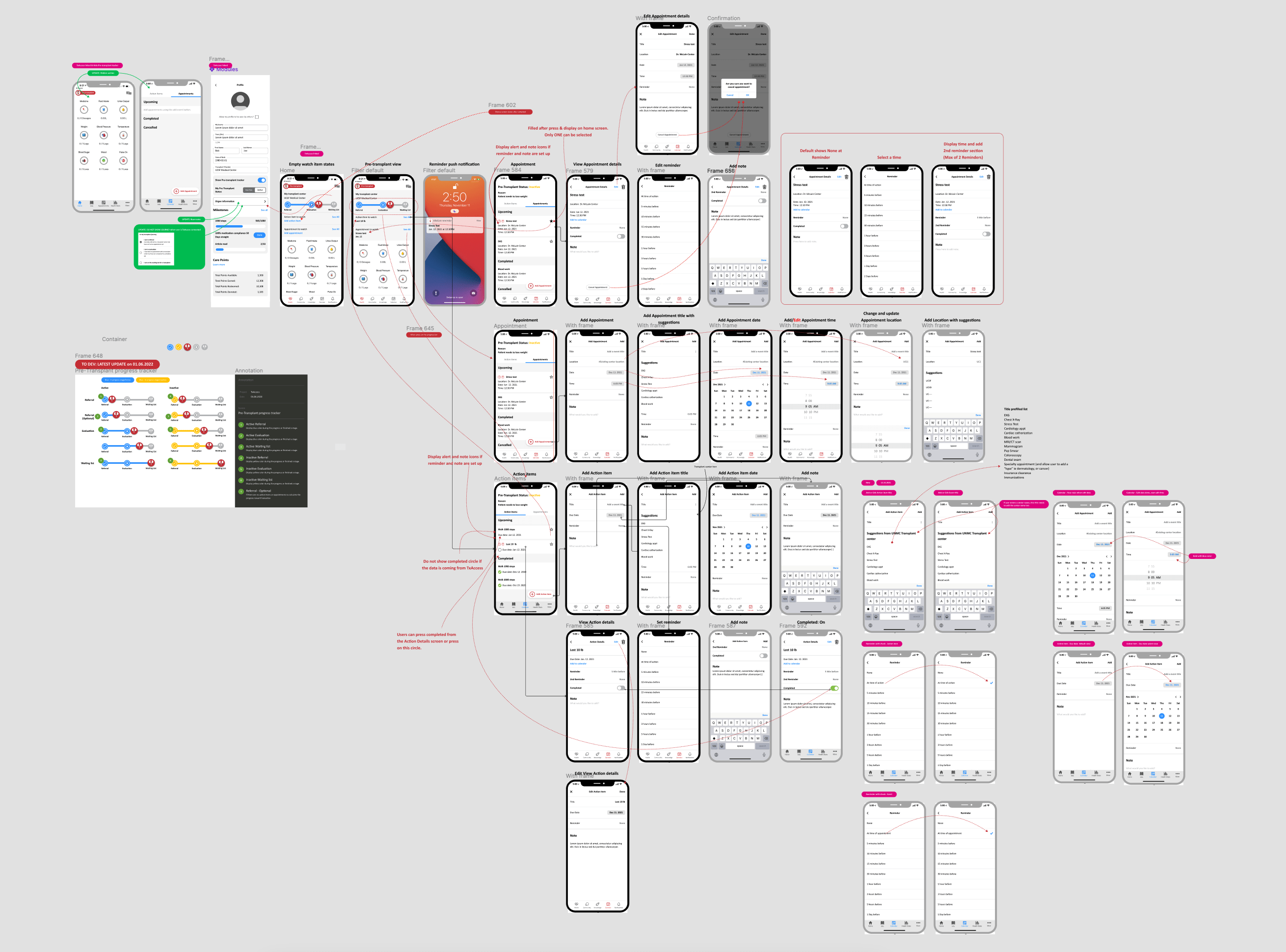
I used the feedback from the focus group, managers, and subject experts. I have designed several versions and ensured the focus group feedback is applied to the design. I also added all the business requirements coming from the stakeholders.
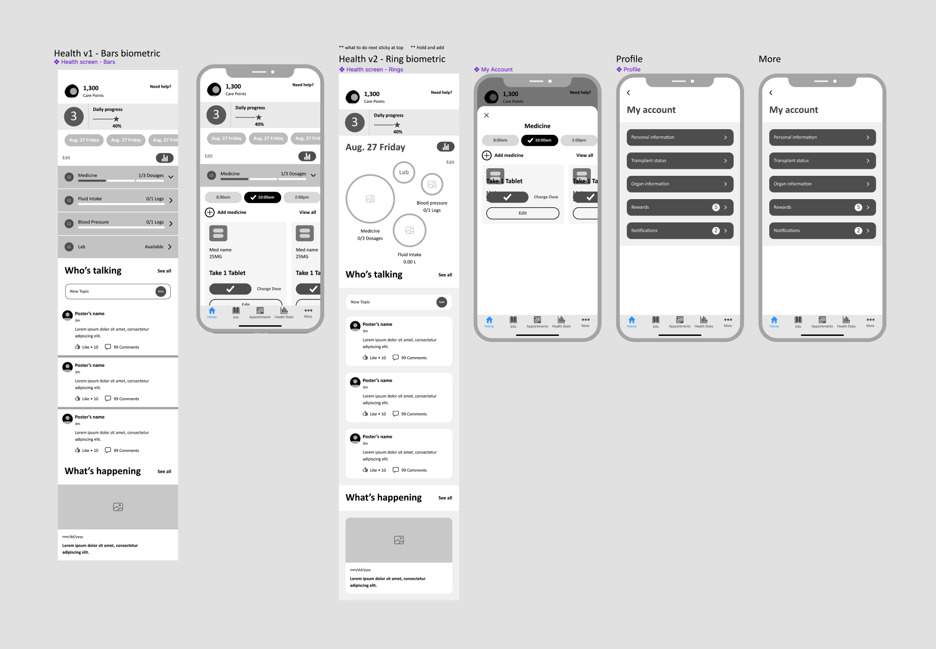
Home screen design variation
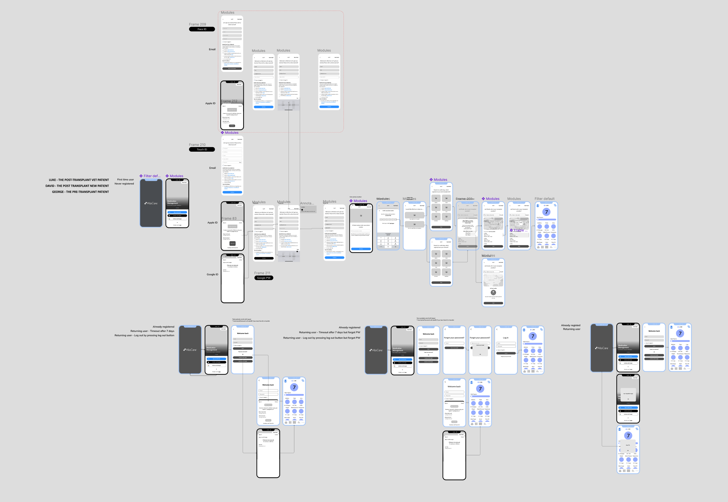
Registration design
Med screens design variation
Pre-transplant design
Usability Testing
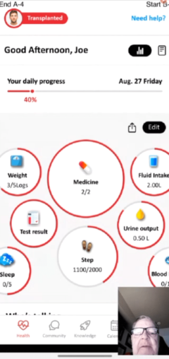
I created a Principle prototype. The goal was to test several areas where the users visit the most. These areas are Medication management, fluid intake, finding an article, and finding posts from the community. Also, we would like to know what the tester thinks about the new UI.
The testers are the same people from the focus group. It is one on one interview.
Some of the questions we asked
Task 1:
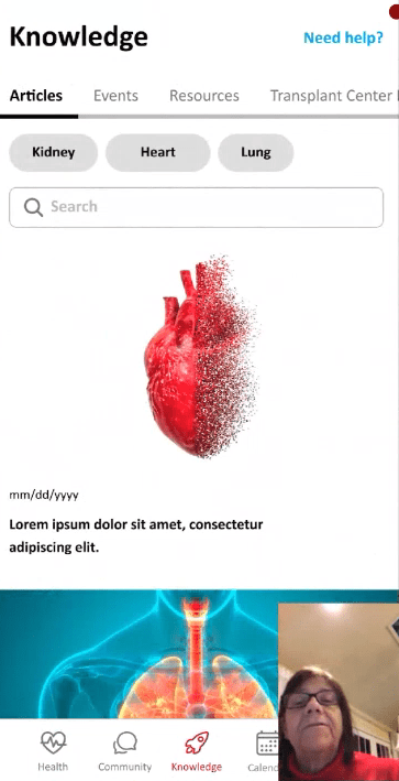
You want to find out from others patients what their experience has been with side effects from Tacrolimus. How would you do this in your app?
Task 2:
Its time to take your morning medication. Log your medicine now
Task 3:
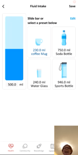
Log that you have finishing drinking a full bottle of water
Developed Design System
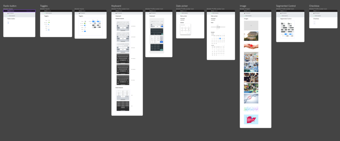
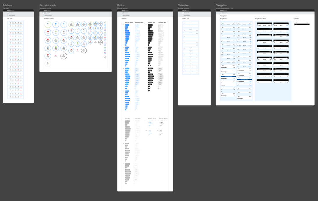
I developed a custom design system for AlloCare using Figma, drawing inspiration from iOS design guidelines and the Android Material design system. The components within the system were customized to reflect AlloCare’s unique brand and style. This ensures visual consistency throughout the app, creating a seamless and appealing user interface aligned with AlloCare’s branding.

UI Design
Main screen
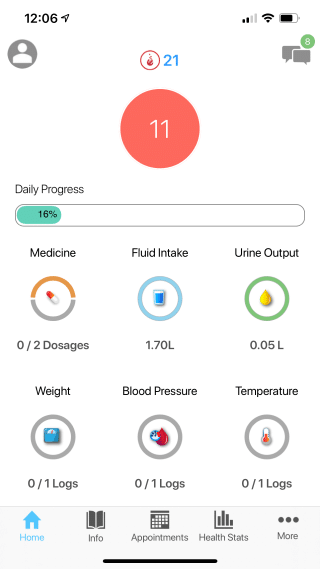
Old design
New design
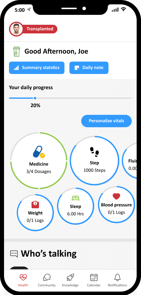
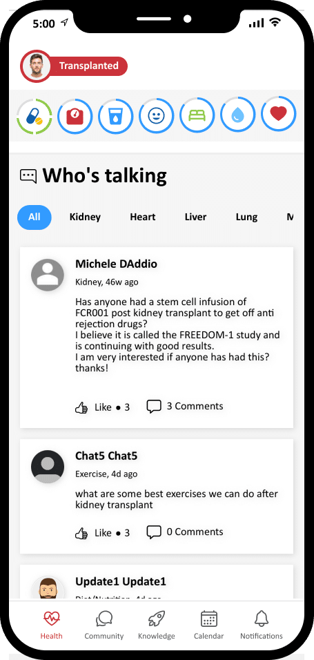
Based on user feedback and research, we introduced dynamic Bubble Experiences that resize while scrolling and allow customization of content. Personalized greetings were added based on the time of day. Additionally, a note feature was implemented on the home screen, enabling users to jot down and share important information with their healthcare team.
Community/Knowledge
Old design
New design
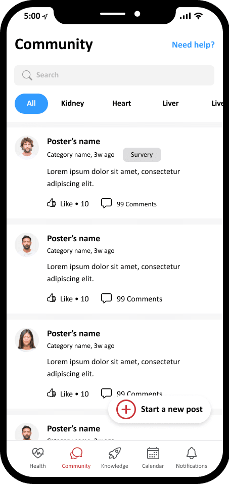
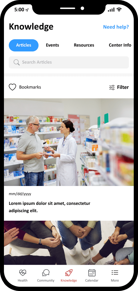
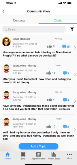
I incorporated enhanced filter functionalities in the Community and Knowledge sections of the app, taking into consideration valuable user feedback. These improvements were implemented to address the challenges users faced in locating specific categories of chats or articles.
Log in/Registration
Old design
New design
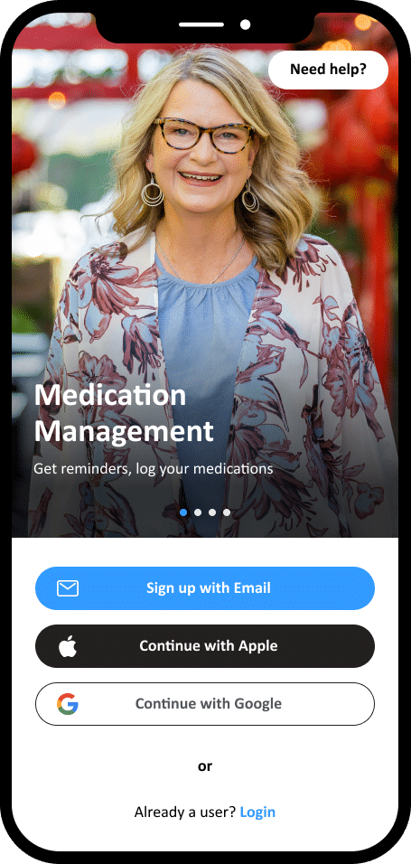
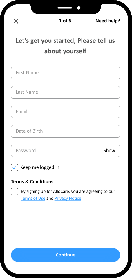
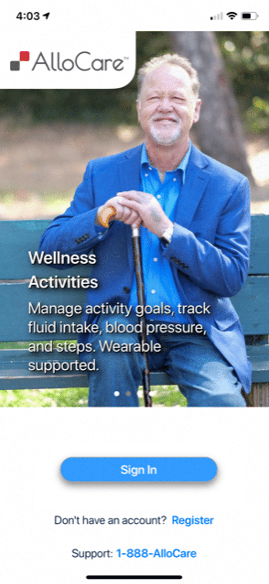
I improved the login experience by adding “Continue with Apple” and “Continue with Google” options. Furthermore, I implemented step numbering on each screen to provide users with a clear indication of their progress.
Fluid intake
Old design
New design
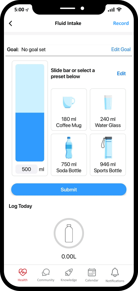
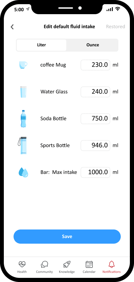
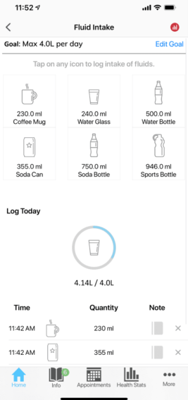
The design features a manual bar with adjustable volume options, complemented by a visually appealing blue color scheme. User testing confirmed that the fluid intake input process is now clear and straightforward.
Medicine
Old design
New design
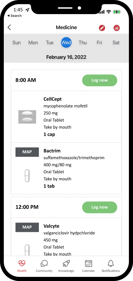
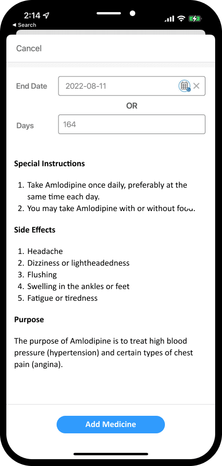
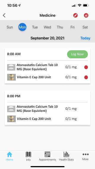
To enhance the medication experience, I redesigned the layout to include larger medication images, clear medication names, descriptions and dosage. Users can also view special instructions, side effects, and purposes when adding new medicine, providing them with comprehensive information at a glance.
Account
Old design
New design
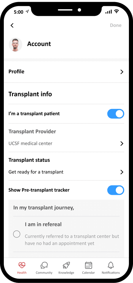
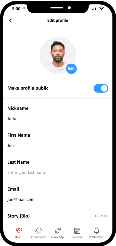
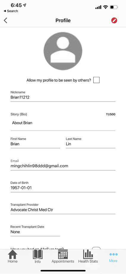
The new account system facilitates easier switching between pre and post-transplant modes, as well as updating transplant and personal information.
Added new features
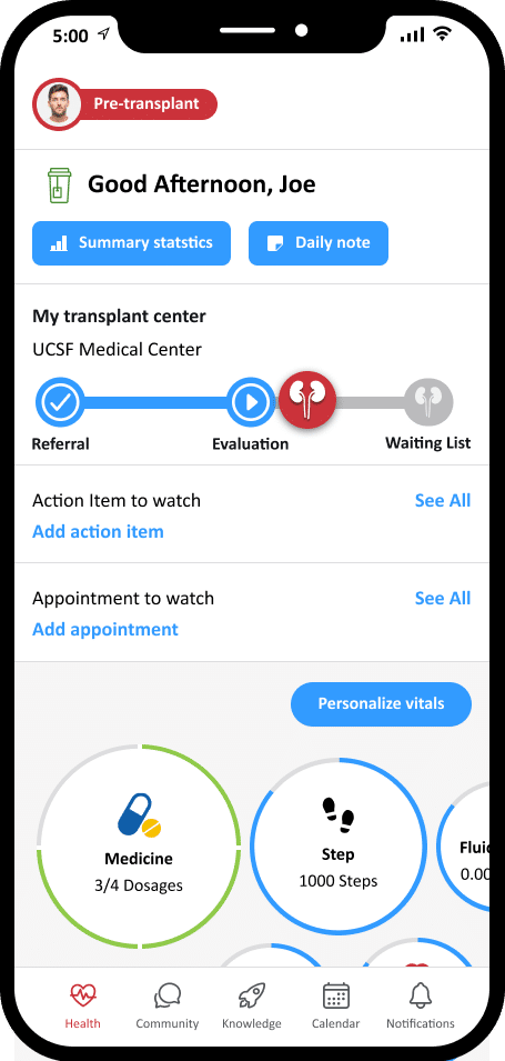
Pre-transplant view
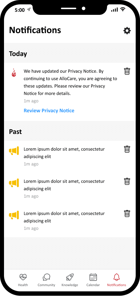
Notifications
Calendar
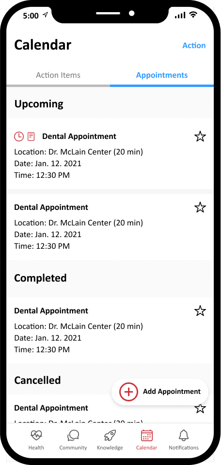
These are the new design additions aimed at enhancing user experiences.
Evaluate the app
After launching the app, I conducted another focus group and usability tests.
1. Focus group
Some feedbacks
– Be able to show the status of users. Especially display the status of the new users.
– Watch webinars on the app or a list of webinars in the library or knowledge.
2. Usability test
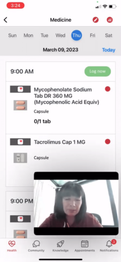
I also conducted the usability test and are testing several new users. I ask for specific scenarios, and we will be able to monitor the user behavior on the app. Besides collecting feedback, I also set benchmarks for each task.
The test focus on finding the article, chatting topic, logging in a biometric, and adding a new med.
Some feedbacks
– Need to create an easy-to-understand med log section.
– More explanation on how to use the log feature.
Takeaway
Throughout the app development process, I gained a deep understanding of the transplant process and the experiences of patients. This reinforced the importance of using data and user testing results to support design decisions and ensure comprehensive and practical feedback from stakeholders. I also improved my skills in setting up and conducting user tests, gathering valuable perspectives, and generating backlog tasks based on user feedback. Working in an Agile environment, I actively collaborated with engineers, benefiting from their insights and feedback in regular team meetings.

